
Table of Contents
What Is Color Drenching?
Color drenching is the technique of painting walls, ceiling, trim, and doors in one single color - creating a fully immersive room that feels intentional and cohesive. Instead of white ceilings and contrasting molding, all surfaces read as the same tone. The result is cocooning and sophisticated, dissolving visual boundaries to make the entire the space feel larger.
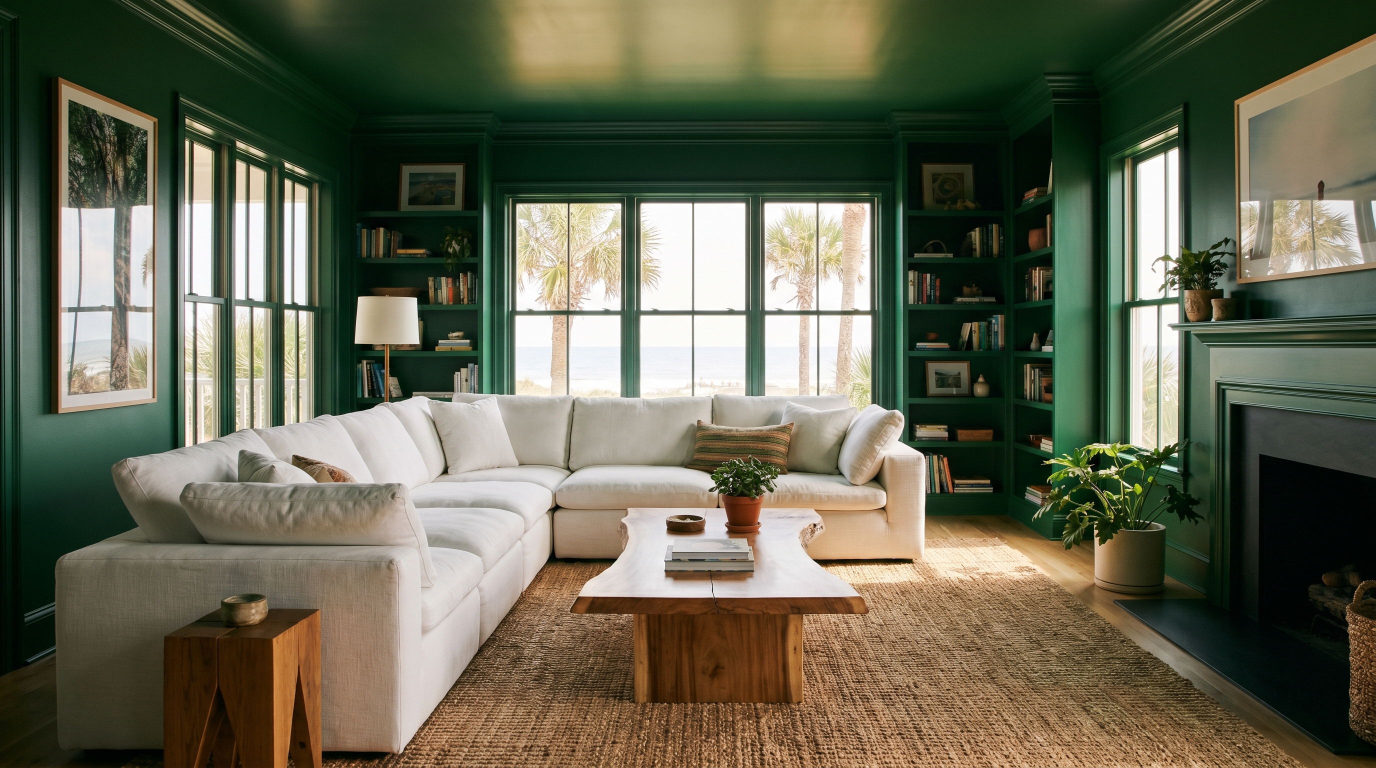
This approach has roots in classic European interiors, where designers wrapped entire rooms in a unified tone for drama and cohesion. Today it’s one of the most requested painting trends in New Smyrna Beach - and for good reason. Whether you choose a bold color like navy or a soft one like sage, drenching transforms ordinary rooms without adding a single piece of furniture.
Some designers refer to related techniques as hue drenching (using closely related tones instead of an exact match) or pattern drenching (adding fabric or wallpaper in the matching color family). The common thread: painting everything in one scheme for maximum impact.
Want This Look in Your Home?
Our color consultation experts pick the perfect color. Free estimates, no obligation.
(386) 576-4730Best Colors for the Drenching Effect
Not every color works for this technique. You need enough depth or warmth to create the immersive effect without making the room feel like a cave. Based on what our clients request most:
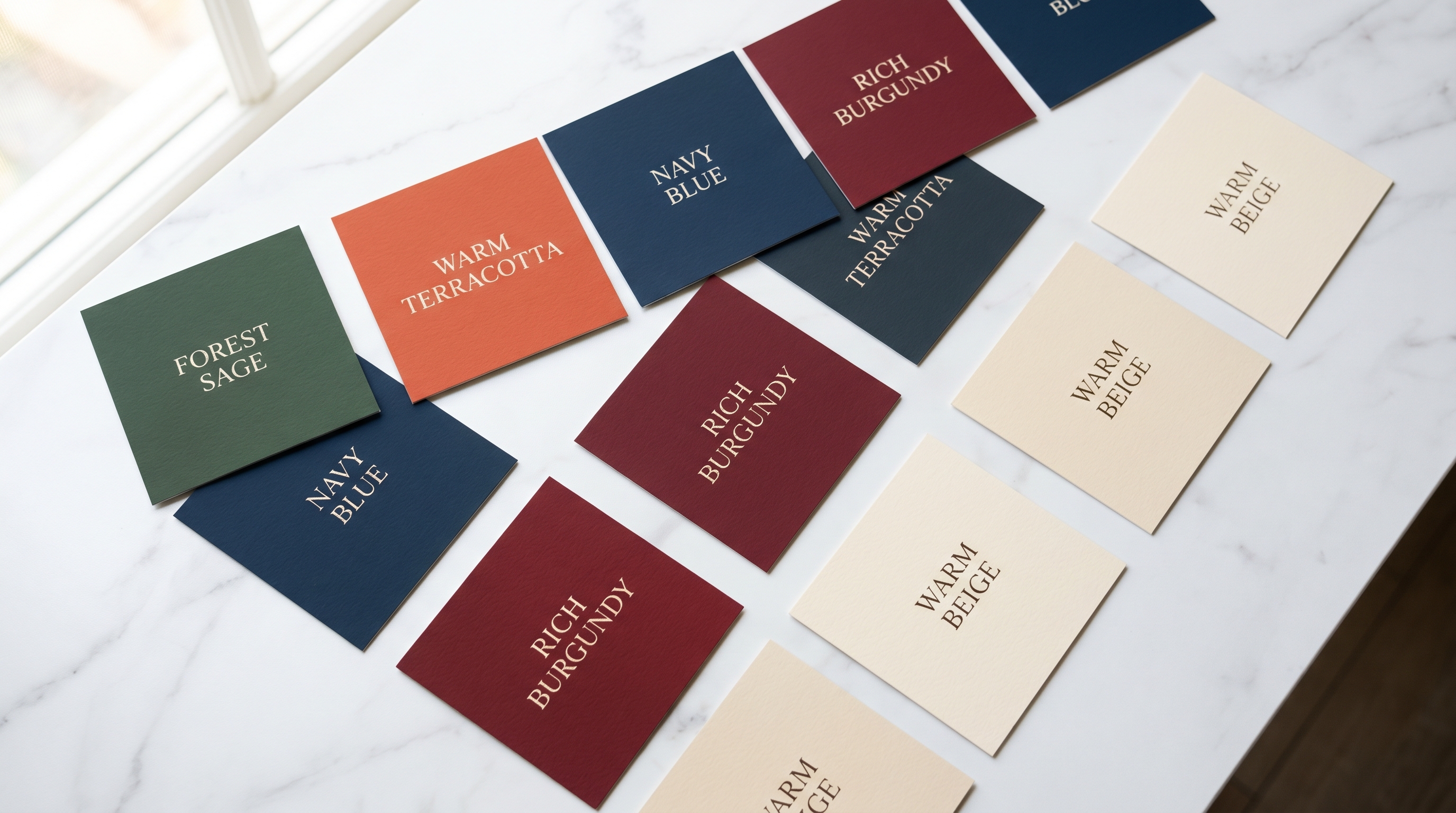
Bold & Dramatic
- Forest green - The most requested pick. Rich, moody, and versatile. Pairs with brass and natural wood.
- Navy blue - Classic and commanding for dining rooms and studies.
- Charcoal - Adds serious depth to living rooms and home theaters.
Warm & Earthy
- Terracotta - Sun-baked clay tones, perfect for kitchens and dining spaces.
- Rust - Grounded, organic warmth that feels Mediterranean.
Soft & Serene
- Sage green - Nature-inspired and calming for bathrooms and bedrooms.
- Pale blue - Airy and tranquil, beautiful in coastal Florida properties.
How to Pull Off This Look
A full room treatment requires more prep than standard interior painting because every detail matters when painting everything the matching color.
- Choose your pick carefully - Test large swatches (2x2 feet) on multiple walls. Live with them 3–5 days. Every tone shifts in different light, especially in Florida.
- Prep all surfaces - When ceiling and trim match the walls, imperfections stand out more. Patch every hole, sand, and caulk every gap.
- Prime with tinted primer - Tinting primer toward your finish color ensures consistent coverage across drywall, wood, and doors.
- Paint ceilings first - Start with the ceiling. Using one color means splatter on walls won’t show - one of the best perks of this approach.
- Roll walls, then trim and doors - Use matte on walls and ceiling, eggshell or satin on trim for subtle depth and wipeability.
Which Rooms Work Best
While this technique can work anywhere, some spaces are natural candidates:
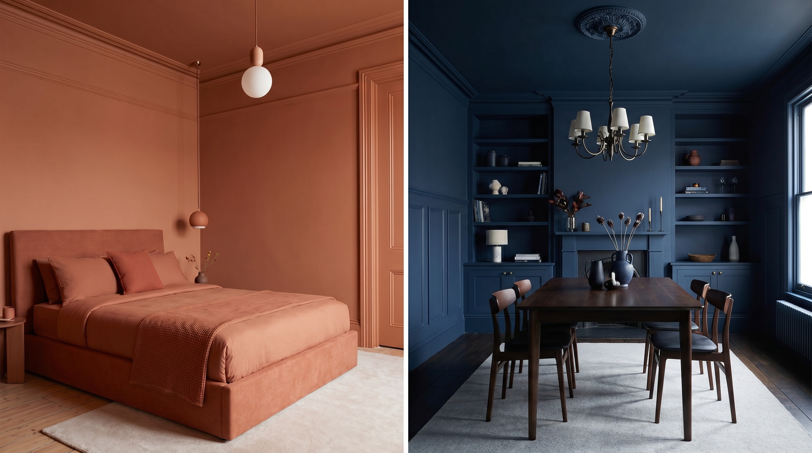
- Bedrooms - Deep greens, charcoals, and navy create restful, intimate rooms.
- Dining rooms - Dark tones like burgundy or forest green feel restaurant-quality.
- Bathrooms - Small spaces benefit most from the seamless effect.
- Kitchens - Cabinets, walls, and ceiling in one color create a high-design look.
- Powder rooms and hallways - Go bold. Low-risk, high-reward rooms.
Which Rooms Work Best
While this approach can work in any room, some spaces are natural candidates for the full treatment:
- Bedrooms - Deep greens, charcoals, and navy create restful rooms that feel like a retreat from the day.
- Dining rooms - Dark tones like burgundy or forest green feel restaurant-quality and make every meal feel special.
- Bathrooms - Small rooms benefit most from the seamless effect. Sage and pale blue are popular choices.
- Kitchens - Cabinets, walls, and ceiling in terracotta or navy create a high-design look that stands out.
- Powder rooms and hallways - These awkward rooms transform dramatically. Go bold - they’re low-risk, high-reward.
Common Mistakes to Avoid
After years of residential painting in New Smyrna Beach, we see the same mistakes when homeowners try this approach without professional guidance:
- Skipping test swatches - A color on a swatch looks nothing like that tone on four walls, ceiling, and trim. Always test large areas first.
- Forgetting about lighting - The same tone can read green in natural light and gray under LED fixtures. Test under all conditions.
- Using different paint brands - Each manufacturer’s base tint differs slightly. Mixing brands means the “same” tone won’t match on different surfaces.
- Leaving the ceiling white - The ceiling is 20–25% of your visual field. Leaving it white while treating everything else defeats the purpose.
- Not prepping the ceiling - Ceiling flaws are just as visible as wall flaws when the tone matches. Patch, sand, and prime with the same care.
- Skipping primer - White primer under a dark tone means 3–4 coats instead of 2. Tinted primer saves time and ensures even coverage.
Designing for Florida Homes
At JPL Painting, we’ve been helping New Smyrna Beach homeowners transform their spaces for years. Here’s what makes drenching work particularly well in our climate:
- Florida light amplifies tone - Our strong southern light makes tones read richer indoors. A sage that looks muted on a chip becomes luminous on four walls.
- Open layouts love unity - Florida properties feature open floor plans. Treating one zone in a single tone creates definition without walls.
- Heat-friendly choices - Light tones like pale blue reflect heat and feel cooler. Darker tones like navy create cozy retreats from the sun.
- Use mildew-resistant paint - Florida humidity demands mildewcides, especially when every surface shares one finish.
- Satin on trim - Higher sheen on doors and baseboards resists moisture and wipes clean - essential in Volusia County properties.
For Florida homeowners, we recommend Benjamin Moore’s Aura or Sherwin-Williams’ Emerald. Both offer exceptional coverage for deep tones, mildew resistance, and the color accuracy that matters when the whole room is one color. From prep to perfection - that’s the JPL promise.
New Smyrna Beach’s climate makes this technique especially effective:
- Florida light amplifies tone - Strong southern light makes shades read richer and more saturated indoors.
- Open layouts love unity - Drenching one zone of an open floor plan creates definition without walls.
- Heat-friendly choices - Light tones like pale blue reflect heat; dark tones create cool retreats.
- Use mildew-resistant paint - Florida humidity demands mildewcides.
- Satin on trim - Higher sheen on doors and baseboards resists moisture and wipes clean.
Florida’s Climate is Tough on Paint - We Know How to Handle It
Locally owned in New Smyrna Beach. Premium products, expert application.
(386) 576-4730Frequently Asked Questions About Color Drenching
Yes. Color drenching eliminates visual boundaries and creates a unified scheme that makes rooms feel larger and more intentional. It’s especially popular for bedrooms, dining rooms, and bathrooms. The 70/20/10 rule is a classic design principle where 70% is your dominant tone, 20% secondary, 10% accent - drenching pushes the dominant to near 100%, with furniture and decor providing the remaining interest.
No - it’s trending stronger than ever. Google Trends shows searches up over 300% year over year. The technique has roots in classic European interiors and is now one of the most requested painting approaches at JPL Painting. Designers consider it timeless, not a passing fad.
Rich, saturated tones work best: forest green, navy blue, terracotta, and charcoal. Soft tones like sage green, blush pink, and pale blue also create beautiful results. Avoid pure white - the effect depends on pigment to merge surfaces visually.
The 70/20/10 rule is a design principle: 70% dominant tone, 20% secondary, 10% accent. Drenching pushes the dominant to near 100% on all surfaces. You layer in the 20% and 10% through furniture, textiles, and artwork - getting the immersive effect while keeping visual interest through your decor.